Forum closed due to massive spam. Registration only by email. Contact details here |
Tune in to one of the Radio for Robots for Robots streams!
You are not logged in. Please login or register.
Typography (Page 6 of 8)
Robots for Robots → Random media → Typography
Posts: 126 to 150 of 198
Re: Typography
Re: Typography
i got 51183 ![]()
http://fossa.bandcamp.com
Shitting in a lavatory, conducting experiments.
Farticles come near and disappear.
Shitting in a lavatory, conducting experiments.
Farticles come near and disappear.
Re: Typography
61283. Not so good.


Re: Typography
yeehaw

http://fossa.bandcamp.com
Shitting in a lavatory, conducting experiments.
Farticles come near and disappear.
Shitting in a lavatory, conducting experiments.
Farticles come near and disappear.
136 2009-04-14 18:58:18 (edited by Communicator 2009-04-14 19:01:21)
Re: Typography
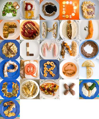
Absolutely lovin' these posters by Paul Lee.
One face, all caps, up to three heights, and that's it. Briliant.
Do it your way, because everyone else is just weird.

Re: Typography
wow
http://fossa.bandcamp.com
Shitting in a lavatory, conducting experiments.
Farticles come near and disappear.
Shitting in a lavatory, conducting experiments.
Farticles come near and disappear.
Re: Typography

http://www.flickr.com/photos/askewtmdsu … otostream/ check for full size
I was so close // I crept like a cat // visions of seduction lurkin under my hat
Zerohour Doom & Glamour | RETALI8 | Cold Crush
Jackie Ransom, Luster & Beta Evers - Secrets Of The World out now on 7"/Digital
Zerohour Doom & Glamour | RETALI8 | Cold Crush
Jackie Ransom, Luster & Beta Evers - Secrets Of The World out now on 7"/Digital
141 2009-04-20 22:50:59 (edited by CED 214 2009-04-20 22:52:10)
Re: Typography
I think it's highly underrated. For sure. Just imagine what you can achieve with Comic Sans on a Nobel Price winner's diploma. (Especially in the litterature category.)
CED214 ? post-Simplastic
Re: Typography
I was going to make a t-shirt with "Art school drop-out" written on it in Comic Sans. I forgot all about that project!
143 2009-04-20 23:32:41 (edited by CED 214 2009-04-20 23:36:34)
Re: Typography
^ genialiskt
"Art is life" isn't too bad a line either
CED214 ? post-Simplastic


Re: Typography
I just had a stroke of serious insights coming through my mind. I really think Comic Sans DOES earn its rights to fill up some space here and there. It's not that bad after all.
Kind of, the ultimate haah hah long-nose towards everything that's too busy or occupied with itself. A perfect seriousness killer. Typography's answer to the clown.
Indeed, it really is comic. After all, imagine the perfect breaking-up or divorcement letter, as written in Comic Sans. Or an NDA. Now that would be a fun NDA to sign.
It's just the perfect kind of anti-stiffness factor that really needs to be there. Comic Sans FTW.
CED214 ? post-Simplastic
Re: Typography
^ and that was written with some whisky stimulation, but anyway.
CED214 ? post-Simplastic
148 2009-04-29 21:43:34 (edited by verisimilitude 2009-04-29 21:44:45)
Re: Typography
A nice short video about a printing press in Brazil that uses a 1920's German letter press
[youtube]http://www.youtube.com/watch?v=kI5RekPMh_c[/youtube]
Re: Typography
Just made this for a Moz fave.
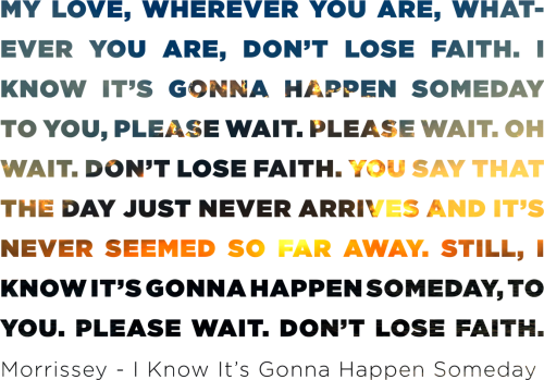
Do it your way, because everyone else is just weird.
Posts: 126 to 150 of 198
Robots for Robots → Random media → Typography
Powered by PunBB, supported by Informer Technologies, Inc.
Currently used extensions: pun_approval, pun_admin_add_user. Copyright © 2009 PunBB